Overview
The DiveLog application is a Java-based desktop application that uses the command-line interface (CLI) as its main user interface. The DiveLog application seeks to provide divers a simple dive log to keep track of and plan their dives. Divers are able to input details of their dives such as the duration they spent at a particular depth and location of their dives. The application will help to calculate and keep track of the pressure group that their body is in right now, so that they are more aware of themselves and plan their future dives sessions safely.
The DiveLog application can accurately calculate the diver’s current pressure group, which is used to calculate when it will be safe to dive again or to go on a plane.
Summary of contributions
-
Major enhancement: added the ability to display the Pressure Group in Color
-
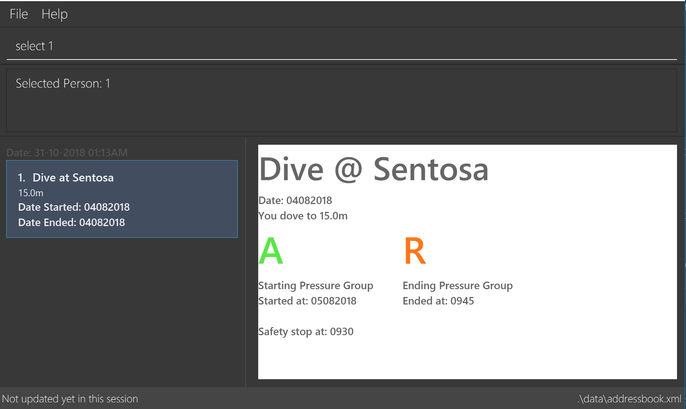
What it does: This allows the user to view their pressure group (starting and ending of each dive session when selected) in colour.
-
Justification: This feature improves the product significantly because a user can make a quick reference of their pressure group(s) when diving to make faster decisions for their dive planning.
-
Highlights: This enhancement has 26 different colours based on the severity of the pressure group. For example, A being the best pressure group is coloured in green, Z being the worst is coloured in red. The pressure group(s) are coloured from Green to Orange to Red.
-
-
Minor enhancement: Created the team’s new logo and updated the names to divelog. Also, added the date time and the dive distance onto the
BrowserPanel. -
Code Contributed [TTTaus]
-
Other contributions:
-
Documentation:
-
[UG] Added the screenshots and introduced the hidden details to make screenshots optional for users to see. Pull Request #78
-
[UG] Amended the tone and grammar issues in the User Guide Pull Request #116 | #145
-
[UG] Documented the colour code of the Pressure Groups
-
[DG] Added and updated the diagrams, architecture, logic flows: Pull Request #56
-
[DG] Added additional debug for Javafx for developers. Made Developer guide into using proper adoc listing format. Pull Request #46
-
-
Community:
-
PRs reviewed (Examples: #66)
-
Suggestions & discussions through comments on Issue trackers (Examples: #58)
-
Reported bugs and suggestions for other teams in the class (examples: #160 for T12-2)
-
-
Contributions to the User Guide
Given below are sections I contributed to the User Guide. They showcase my ability to write documentation targeting end-users. |
Selecting a diveSession : select
Selects the dive identified by the index number used in the displayed dive list.
Format: select INDEX
Examples:
-
list
select 2
Selects the 2nd dive in the Dive Log. -
find Bali
select 1
Selects the 1st dive in the results of thefindcommand.
Diagram 8: Select command
Click here to view the screenshot for a successful select

Contributions to the Developer Guide
Given below are sections I contributed to the Developer Guide. They showcase my ability to write technical documentation and the technical depth of my contributions to the project. |
Colour coding of the Pressure Groups
Through engagement with our test users and from our user stories, the pressure group needed to be obvious and easy to reference to
our users, which meant that it had to stand out on the display. These pressure group would let the divers know if their dives was
safe and how much leeway they might have in the water. As such, the BrowserPanel takes into the account the pressure groups that
are supposed to be returned and adds colour to it.
Design Considerations
-
Current implementation: When the pressure group returned the the
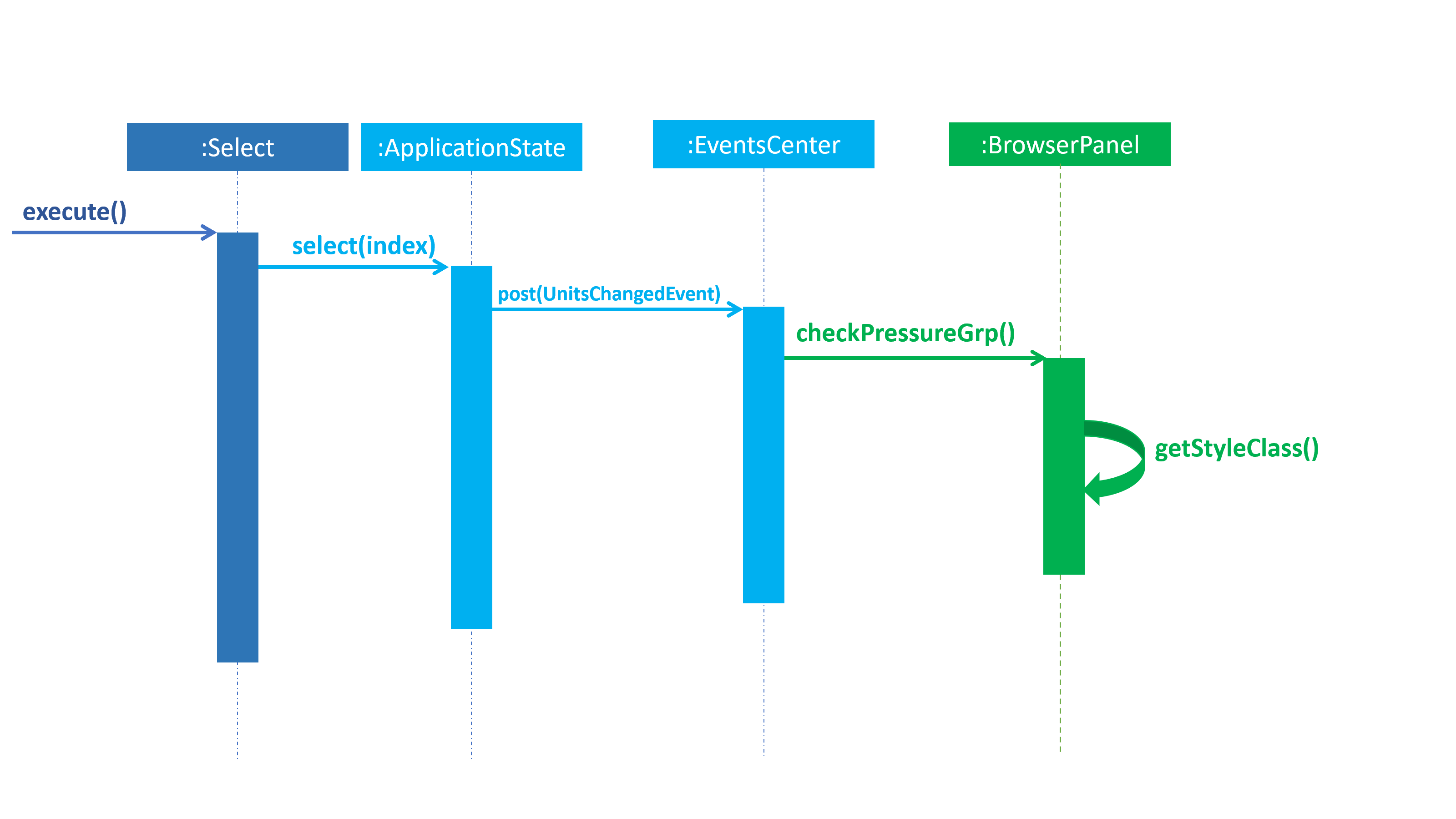
BrowserPanelfor display to the user, the colour is changed by changing its CSS style. The colour is chosen from green [#0FFF0F] to yellow [#F5FF07] to red [#FF0000]. The colour are in order of normal to moderate and finally, dangerous amount of nitrogen in the blood of the user or their pressure group. The colours are seen in the Figure 14 below. As seen in the implementation below (Figure 15), once theApplication Stateis updated, aselectChangedEventis posted to theEventsCenter. TheEventsCenterthen issues a call to check thecheckPressureGrp()to theBrowserPaneland updates the CSS of the pressure group. It will then re-render the UI to reflect the new CSS throughgetStyleClass().-
Pros: The pressure group is clearly distinguished by its severity at one glance.
-
Cons: Not all may be able to use it. For example, users who may be colour-blind.
-


-
Alternative implementation: Instead of changing the colour, the text font maybe increased in proportion to the severity of the pressure group.
-
Pros: Most people would be able to see it. If the text is very big, the warning regarding its severity will be obvious.
-
Cons: May make the UI and screen messy. Will need to have a comparision chart to compare the size to.
-
-
Potential Improvements: The current implementation could be combined with the alternative implementation, to make the emphasis on the pressure group being severe. For example, the pressure group could be in the red zone (dangerous/severe zone) and the text font would be increased.
-
Pros: Makes it even clearer, especially if the pressure group is at dangerous levels. Allows more users to potentially benefit from it.
-
Cons: If not properly implemented, it might end up making the UI messy.
-